Thursday, 22 December 2011
Friday, 9 December 2011
Character Sketch-Kenji Endo
This character is from a one of my favourite mangas called 20th Century Boys and I thought it would be cool to do a sketch to show my fandom to Endo Kenji.
Labels:
21st,
art,
Century Boys,
Endo,
fan,
illustration,
Kenji,
Manga,
pencil,
sketch
Monday, 5 December 2011
Friday, 2 December 2011
3D Work-Fish Animation
Thought I'd put up my fish animation but I'm tempted to work on it a bit more.Blogger has kind of messed up the quality of the video too.
Sunday, 27 November 2011
Sunday, 13 November 2011
Wednesday, 19 October 2011
Tuesday, 6 September 2011
Character Sketch-Red Dead Redemption
Sorry I haven't posted anything in a while internet, I've been a bit busy. :( I'll try to keep uploading any bits and pieces that might be interesting on a regular basis. Thought I'd start off with one of my favourite game characters John Marston.
Labels:
character,
game,
illustration,
pencil,
red dead,
redemption,
sketch
Monday, 4 July 2011
Friday, 24 June 2011
Thursday, 23 June 2011
Monday, 6 June 2011
Contextual Influences-Tony Moore
Tony Moore is an american comic illustrator who has worked on various comics including Battle Pope and the populer walking dead series. He studied printmaking, painting and drawing and started his illustrator career in 1999. He has a very edgy and defined style which can be seen in the crsip and detailed illustrations he creates. I discovered his work whilst reading the walking dead and he has made the story much more intriguing and interesting to read and I would like to try and draw a couple of scenes from the book in my spare time.
Wednesday, 25 May 2011
Thursday, 5 May 2011
Wednesday, 20 April 2011
Thursday, 7 April 2011
Contextual Influences-Carlo Arellano/Chainsaw
I found the blog chainsaw art through Matt Rhodes' blog and discovered more excellent concept art. Carlo Arellano lives in the U.S and has worked on Van Helsing, world of warcraft and more. I'm fascinated with robot and mech drawings so his work caught my eye. His style of clear and clean images is very impressive, realistic and shows great creativity.
Contextual Influences-Matt Rhodes
Whilst looking for inspiration in how to improve my work I discovered the remarkable drawings of Matt Rhodes, a concept artist who has worked on the mass effect series among other things. I really love the richness of colour and attention to detail in his cartoon-like visuals. He has inspired me to go into further detail with my drawings and to use colour effectively in Photoshop. Through his blog I have also found other artists that interest me.
Tuesday, 29 March 2011
Safe and Sound Campaign-Poster Design
The brief for this project required a piece of graphics to promote and support the work of the safe and sound group for young people. I decided to create a poster design to raise awareness of internet security for young people (12-14 years old). The Illustrator Peter Mac was a great influence in my design because of his really vibrant and stylized pieces which suited my target audience. I wanted my message to get people thinking about how secure they were online so I wanted create a dark theme to my idea to portray this. I have created a typical notebook style with doodles and drawings that suit the theme and are relatable to the audience.
Contextual Influences-Matthias Schardt
During a college project I researched into various illustrators and designers gain inspiration for a distinct style. Whilst researching I discovered a German Illustrator called Matthias Schardt, whos style was very compelling and simple. He creates the majority of his work by using black indian ink to create a simple outline and shading and then uses Photoshop to add extra details and colour. I really like looking at his work as it shows talented drawing skill and great use of colour.
Friday, 25 March 2011
Tuesday, 22 March 2011
Thursday, 10 February 2011
Thursday, 27 January 2011
Contextual Influences-Shadow of the Colossus
Shadow of the colossus is a PS2 game created by Team Ico in 2006. The main point of the game is to find and slay 16 colossi in this huge open world that was ahead of its time. The intriguing design of these creatures and the world they inhabit is truly unique and is really immersive. I especially like how well the size of the creatures have been portrayed with there smooth and slow movement that makes them believable.
Wednesday, 19 January 2011
Equality and Diverity-Poster Design
This live project was to promote equality and diversity in Chesterfield College and we were given a brief and theme to design our posters for. Mine was race so I decided to incorporate the use of monochromatic colours within my poster and to use the slogan 'Difference divides/defines us'. I wanted to use simple objects in black and white, for example a football, and show two versions of the object with one version missing a colour and appearing distressed and destroyed. Eventually I chose chess pieces as it was simple and a more abstract way of looking at racism.
Ideally I would have liked to have taken a photo of an actual chess board but time constraints limited me to using images found on the internet and using a mix of Adobe Illustrator and Photoshop. I think that I have used the contrasting colours to effectively send a message and get peoples attention.
Wednesday, 12 January 2011
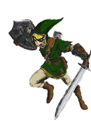
Character Sketch-Link
This is a sketch of the videogame character link that I've drawn in my spare time. I used an existing concept art picture and referenced that. I appreciate any critique to help improve my technique and I'll put up new drawings onto my blog in the future.
Subscribe to:
Comments (Atom)


